- Internet
- 09.04.2018
- EN
Responsive Images – Web Design with Device Optimized Images
written by Danny Baggs, 02. March 2012
Responsive web design continues to sweep across the web industry for good reason. However, there are still challenges that exist, which in part help to shape standards (i.e. changes to the CSS Box Model due to border placement) as well as adapt design and development approaches moving forwards.
One of these such challenges is around images, delivering an optimal image for a given device. Its on this particular topic that I’d like to share my approach for solving this challenge.

Motivation
The motivation for solving this problem stems from a couple of things:
First of all, I’ve been keen to ensure that images added to pages by non-technical page authors and editors are not overly large for the consuming device. Whether that device be a smartphone or a desktop machine with a large hi-res monitor is regardless, applying context of that device’s attributes simply makes sense. In other words, there is no point delivering a 1600px x 1000px image to a mobile device with a physical screen resolution of 480px x 800px and simply letting CSS manage the scaling for instance. Whilst this would work, it of course wastes bandwidth.
Secondly, although I’m not very talented in the design department and would tend to favour a partnership with an agency or individual who is, I’ve grown a deep love for good typographic best-practice and it simply disturbs me when images can throw the vertical rhythm out of sync. I know to some, vertical rhythm is not so important but hey, I’m a Brit who now lives in Germany, so please forgive me this adopted solid German trait of attention to such detail.
There are client-side solutions to these challenges coupled with an approach to pre-prepare images for replacement, but this preparing of several sized images just feels like too much effort to me and not truly responsive. I was keen to solve this challenge server-side, where I could rely on the technology available and optimise where necessary.
The Approach
The first thing I did, was to make a decision about what I define the optimal delivery of an image to be. To me, this simply meant delivering images with dimensions that were not greater than the physical dimensions of the viewing device. The thinking here is in the saving of bandwidth and the improvement of page load times, which is something any mobile developer worth their salt should keep in mind.
Device Detection
I’ve been using services like WURFL and more lately DeviceAtlas for some time now and knew that such additional information like the physical screen dimensions could be extracted from the service. Therefore, this provided my constraints for my device specific maximum image size.
As there are a few device detection services out there, I’m not going to go into the specifics of any one and would encourage further reading in the device detection service of your choice for how to extract such additional details.
Ticking this sub-challenge off then got me thinking about how image processing software allows you to re-sample images and led me to the next stage of my quest.
Applying an Old Pattern
As with most things in this world of ours, if you abstract your challenge, you’ll be able to find a solution that’s been applied to a similar if not the same problem before. In this case, most Content Management Systems provide a way to generate thumbnails, which gave me the clue to simply re-purpose this existing logic.
For my “weekend projects”, I utilise a very strong PHP based Open Source Content Management System called Concrete5. So I decided to check out how that allows you to creates thumbnails.
The CMS provides an ImageHelper class for such tasks, which takes a path to an existing image and re-samples the image to maximum constraining height and width. For completeness, and because this is the real engine room of the solution, the method can be seen below:
/**
 * Creates a new image given an original path, a new path, a target width and height.
 * @params string $originalPath, string $newpath, int $width, int $height
 * @return void
 */
 public function create($originalPath, $newPath, $width, $height) {
     // first, we grab the original image. We shouldn't ever get to this function unless the image is valid
     $imageSize = @getimagesize($originalPath);
     $oWidth = $imageSize[0];
     $oHeight = $imageSize[1];
     $finalWidth = 0;
     $finalHeight = 0;

     // first, if what we're uploading is actually smaller than width and height, we do nothing
     if ($oWidth < $width && $oHeight < $height) {
         $finalWidth = $oWidth;
         $finalHeight = $oHeight;
     } else {
         // otherwise, we do some complicated stuff first, we divide original width and height by new width and height, and find which difference is greater
         $wDiff = $oWidth / $width;
         $hDiff = $oHeight / $height;
         if ($wDiff > $hDiff) {
             // there's more of a difference between width than height, so if we constrain to width, we should be safe
             $finalWidth = $width;
             $finalHeight=$oHeight/($oWidth/$width);
         } else {
             // more of a difference in height, so we do the opposite
             $finalWidth=$oWidth/($oHeight/$height);
             $finalHeight = $height;
         }
     }

     $image = @imageCreateTrueColor($finalWidth, $finalHeight);
     switch($imageSize[2]) {
         case IMAGETYPE_GIF:
             $im = @imageCreateFromGIF($originalPath);
             break;
         case IMAGETYPE_JPEG:
             $im = @imageCreateFromJPEG($originalPath);
             break;
         case IMAGETYPE_PNG:
             $im = @imageCreateFromPNG($originalPath);
             break;
     }

     if ($im) {
         // Better transparency - thanks for the ideas and some code from mediumexposure.com
         if (($imageSize[2] == IMAGETYPE_GIF) || ($imageSize[2] == IMAGETYPE_PNG)) {
            $trnprt_indx = imagecolortransparent($im);

            // If we have a specific transparent color
            if ($trnprt_indx >= 0) {
                // Get the original image's transparent color's RGB values
                $trnprt_color = imagecolorsforindex($im, $trnprt_indx);

                // Allocate the same color in the new image resource
                $trnprt_indx=imagecolorallocate($image, $trnprt_color['red'], $trnprt_color['green'], $trnprt_color['blue']);

                  // Completely fill the background of the new image with allocated color.
                  imagefill($image, 0, 0, $trnprt_indx);

                  // Set the background color for new image to transparent
                  imagecolortransparent($image, $trnprt_indx);

             } else if($imageSize[2] == IMAGETYPE_PNG){

                  // Turn off transparency blending (temporarily)
                  imagealphablending($image, false);

                  // Create a new transparent color for image
                  $color=imagecolorallocatealpha($image, 0, 0, 0, 127);

                  // Completely fill the background of the new image with allocated color.
                  imagefill($image, 0, 0, $color);

                  // Restore transparency blending
                  imagesavealpha($image, true);
             }
        }

        $res = @imageCopyResampled($image, $im, 0, 0, 0, 0, $finalWidth, $finalHeight, $oWidth, $oHeight);
        if ($res) {
            switch($imageSize[2]) {
                case IMAGETYPE_GIF:
                    $res2 = imageGIF($image,
                                   $newPath);
                    break;
                case IMAGETYPE_JPEG:
                    $res2 = imageJPEG($image,$newPath, AL_THUMBNAIL_JPEG_COMPRESSION);
                    break;
                case IMAGETYPE_PNG:
                    $res2 = imagePNG($image, $newPath);
                    break;
            }
        }
    }
}
As you can see within the above code, if you chose to glance through it, the function heavily relies on PHP’s GD Library and its ability to extract image info and resample images.
Credit goes to the guys at Concrete5 for the code above.
Actual Usage Scenario #1 – Mobile Devices
I built a desktop website for a good friend and additionally built a mobile site for him as well. I wanted to empower him to manage all editorial changes via the desktop site CMS and re-use image assets where possible for the mobile site. Before, many of you responsive evangelists scream “Why did you not just build a responsive site?”, the answer is in part because I wasn’t too aware of the Responsive Web Design movement at the time of doing this particular favour and my friend and I genuinely thought a mobile focused site was the right option anyhow. Its a debate that many still have and there many varied factors as to why go one way or another that I’m not going to cover here.
Using ‘responsive’ principles, you may typically assign an image element a specific percentage width of the device screen either directly or indirectly via it taking up 100% space as given to it by its parent element. Crudely, you could use the above function to re-sample the original image to be no wider than the physical device width given the info from the device detection service. This would ensure no over bloated images being sent down the connection. This is particularly key when CSS constrains the visible width of the same image on the desktop site and the author/editor has no understanding of the image’s true size and its impact.
This could be taken one step further in that if you knew that the image is constrained to say 25% of the device width, you can calculate this server-side and again use the above function to re-sample a more optimal image for use.
Actual Usage Scenario #2 – A Constrained Page Element
In another weekend project, a less responsive but pixel perfect design was desired. It was important for the “client” (another friend), that the image elements on any given page of the site, aligned with the baseline rhythm of the page. It was also likely that the images would be uploaded by the author and editor into the CMS and unlikely that these assets were meticulously prepared. In other words, the dimensions of the images that were to form a rotating slideshow would vary but the challenge was to maintain consistency in the slideshow and make all images appear the same size.
The above method for re-sampling images in collaboration with another trick solved this particular challenge.
In this case, instead of the device defining the image size constraints, the page element is.
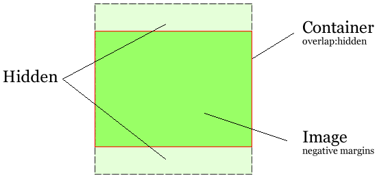
To visually optimize the available space within the image element, I chose to additionally implement a little logic that wraps the image inside an element whose overflow CSS property is set to hidden and centralises the image within that element using negative margins. This provides a “poor mans crop” for the image. The logic to decide whether to constrain the width or height of the original image is slightly outside the focus of this post so will leave it out but it would be suffice to say that I simply used the ‘getimagesize’ GD Library method to understand the original dimensions to do some calculations within the context of the target (containing) dimensions.

Although this second approach is not necessarily related to Responsive Web Design directly, it does allow for a level of control over those images that CMS authors and editors may upload without understanding the impact of image size.
Optimising
It goes without saying, that when images are being processed and prepared server-side for optimal delivery over the connection between the client and the server, that you don’t want to be doing such image processing for every single image every single time. Therefore, in both the scenarios above, I’ve made great use of a server-side cache as well as utilising best-practice to encourage browser based caching. For scenario #1 above, many devices tend to have similar resolution screens so grouping devices can further improve things (i.e. serving a 500px wide image to a 480px wide device allowing for the CSS to manage the on-screen size is not exactly terrible).
Conclusion
There may be other ways to crack this nut and I’m certainly interested to see how CMSs start to address this issue moving forwards but this has worked well for me. I’m looking to further the approach so that I can create a solution for that niggle around images that break the vertical rhythm.
Would love to hear the thoughts of others as well as other approaches to the same challenge. Therefore, feel free to leave a comment.
Source: Responsive Images – Web Design with Device Optimized Images
© copyright 2012 by Danny Baggs