
- Internet
- 18.06.2019
- EN
Manuel Schnitger: WSM 11.2 - Focus on Mobility Pt. 3
written by Manuel Schnitger, 29. January 2014
Device Preview
Next to the Mobile Preview that has been released in version 11.2 of Web Site Management there is another functionality called Device Preview which is also brand new and in the focus of this post. So first of all what is the difference between the Mobile Preview and the Device Preview? Pretty easy. The Mobile Preview is a functionality that opens a new window in a size that the user selects and shows the preview of a page within this window. So the mobile preview is a tool that is designed to give the editors and authors an idea of how an article would look like on a device with a specific display size. More information about the mobile preview and why authors should use it can be read in a former post of this blog: Manuel Schnitger: WSM 11.2 - Focus on Mobility Pt. 2
But now let’s have a look at the Device Preview.
The general ideas of the device preview are that…
- in a lot of situations it’s not enough to just resize a window because a page can also act differently depending on browsers, platforms/operating systems, color depth, etc.
- not just the software but also the hardware needs to be considered. So when we look at mobile devices then some of them come with a touchscreen (iPhone, iPad, etc.), some can be used with a specific pen and some have a trackpad. And especially when the user shall interact with the site (by using buttons, icons, forms, etc.) then it’s really important to use the original device and not just an emulator.
- it’s not really possible to install emulators for all available devices. And even if one installs 10 diffenrent emulators… what happens in one year when new devices with new specs are used?
So the conclusion is: If we can’t have all devices, browsers and platforms on the editorial server then we just display the preview directly on the devices.
How does it work?
Step 1: Within the SmartEdit mode the editor calls the context menu and choses the option “Device Preview”. A dialogue opens up and shows a token. This token is valid for 90 seconds.
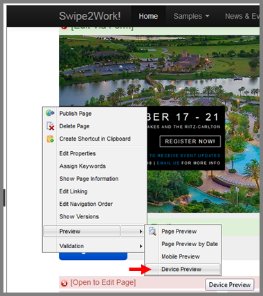
Figure #1: Device preview is called via the context menu
Step 2: The editor communicates the token to the guy who wants to see the preview.
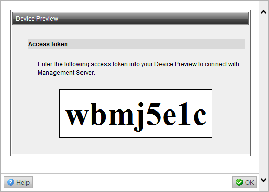
Figure #2: Dialogue with a token is displayed on the Management Server
Step 3: The guy who wants to see the preview calls the device preview on his device* and enters the token. (Of course once the guy entered the token the time frame of 90 secs its not longer critical.)
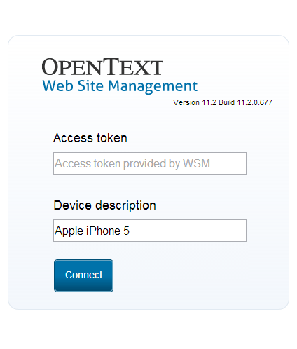
Figure #3: Token can be entered in the dialogue of the (mobile) device
Step 4: Ready. The preview is displayed and each and every page the editor calls in SmartEdit will be transferred to the corresponding device*.
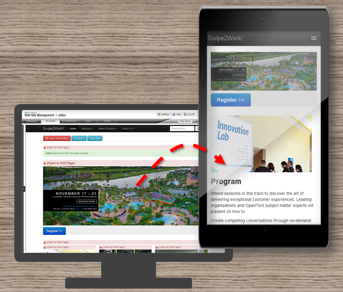
Figure #4: Preview is being displayed on the mobile device. (Synchronized browsing)
*Note: The device can be a smart phone, another browser on the same or another pc, it can be everywhere and on every device. Whenever you have “something” that can open a web page then you can use the device preview.
What are the use cases for the Device Preview?
- You can test web sites in browsers and environments which aren’t installed on the Management Server. A lot of browsers -but not each and every one (e.g.: Maxthon)- are supported for the work with the Management Server. So if you would like to have a preview in a specific browser, then just call the device preview, enter the token and that’s it.
- If you would like to discuss specific topics regarding the web site with your colleagues which are not in the same office then just tell them the token and they can use their environment -be it a smart phone, a tablet pc or a desktop computer- in order to join the conversation and talk about the pages. That way it’s easier for web teams to collaborate on web pages.
- Colleagues or other people you’d like to work together with don’t need to be users within Web Site Management. So if someone who isn’t involved in createing the web site would like to join the conversation from time to time….no prob… he can look at the preview but cannot do anything wrong ;)
In the next post we’ll have a closer look at the new Mobile Frontend and the things which are related to it.
Source: WSM 11.2 – Focus on Mobility Pt. 3
© copyright 2014 by Manuel Schnitger