
- Internet
- 23.04.2019
- EN
Manuel Schnitger: Sneak Preview "Mobile Frontend in WSM 11.2"
written by Manuel Schnitger, 8. May 2013
Next to the preview option for mobile devices the introduction of the mobile frontend is another major feature of OpenTexts Web Site Management V 11.2. The user interface of the mobile frontend has been created by the UXD team (User Experience Design) and the functionality has been implemented by the R&D team in Oldenburg/Germany; so the frontend is not just adopted to mobile devices but completely new. The result of this team effort is a frontend that combines a well-thought-out set of functionality that enables mobile authoring in the best possible way with the characteristics of an application that is tailored to be used on tablets. The beta tests are scheduled for this summer and the frontend will be available with WSM 11.2.
Ok, instead of wasting space with a graphic that shows the market shares of desktop pcs, notebooks and tablets and ends with the conclusion that tablet pcs will become more and more important, I’ll just start with some screenshots in order to give you an idea what to expect from WSM 11.2.
Dashboard
The Dashboard is the entry place that provides shortcuts to things you often do or need (creating pages based on specific content classes), to pages you’ve worked on and to recently uploaded images.
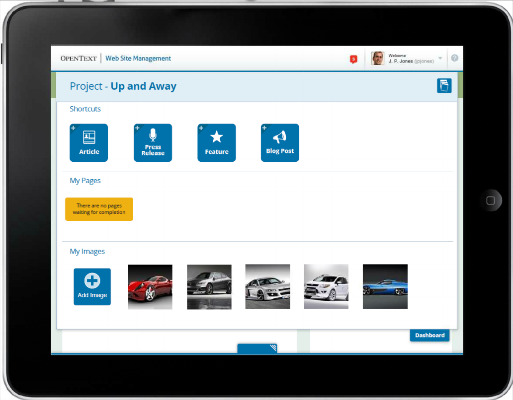
Figure #1: Dashboard
Edit Mode – General idea
What editors and authors do most is create new content or modify existing content. What they need to do so is pretty easy: An edit mode with inline editing in order to insert content in a very intuitive way, a form mode for bigger amounts of content and a preview option. And that’s exactly what the system provides in the editing mode of a page. Be in the edit mode and swipe to the right and you’ll get the form mode or swipe to the left and see the preview. That’s it. Well, of course you need a button to save the modifications or to publish the page but these buttons are in the center and there is no need to swipe ;)
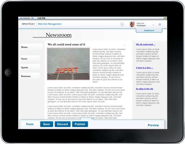
Figure #2: Edit Mode
Panels
Panels -or whatever the ribbon-style fly out menus at the bottom of the screen are called- provide different options depending on the task you’re about to execute. In figure #3 the author just tipped on an image and therefore the Asset Panel opened up. Here you can either chose an image that has recently been uploaded or upload a new one. And if you’ve changed an image and are satisfied with the result, then just tip on Done and …..you’re done ;) (Btw.: If you’re not satisfied then tip on the red button with the white cross displayed in the upper right corner of the image.)
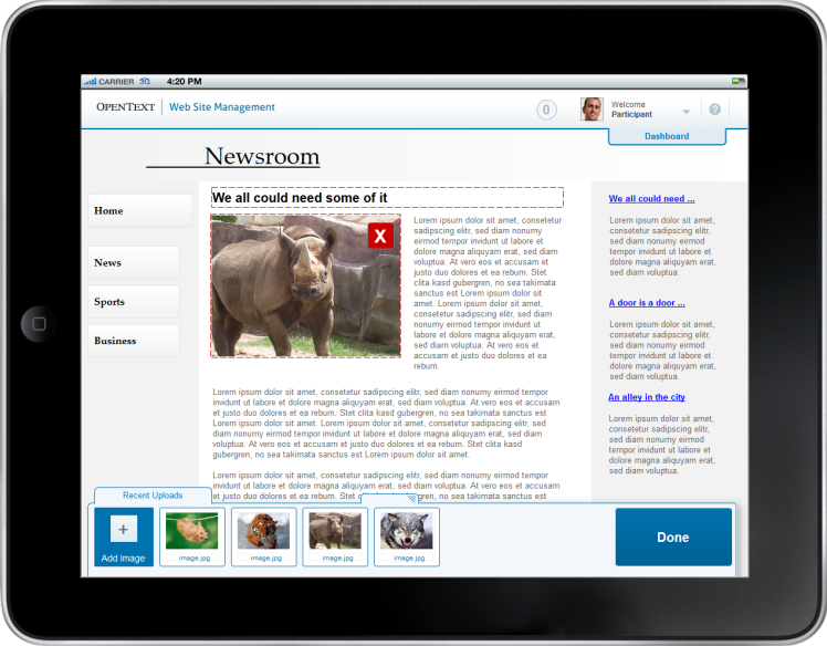
Figure #3: Asset Panel
Asset Manager
Whenever you don’t find the image you’ll like to insert into your article in the current folder that is displayed in the panel at the bottom of the screen, you can just open the Asset Manager that shows all folders and you can open another one.
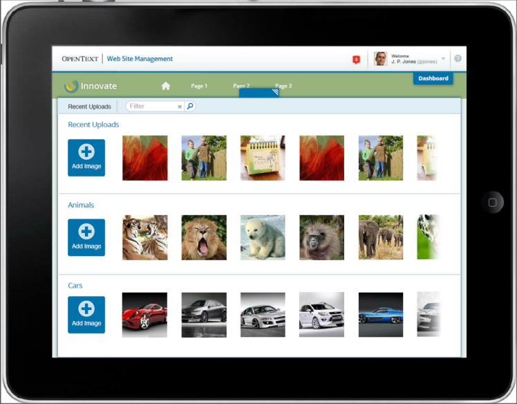
Figure #4: Asset Manager
Form Mode
You have lots of different things to enter and prefer the Form Mode? No problem at all. Just swipe to the right and the form mode is displayed. Here you can edit all elements that are displayed such as text, images, downloads videos and so on but also the meta information, keywords and other things that are not really visible on the page. Next to this the page detail information are displayed at the bottom of the form.
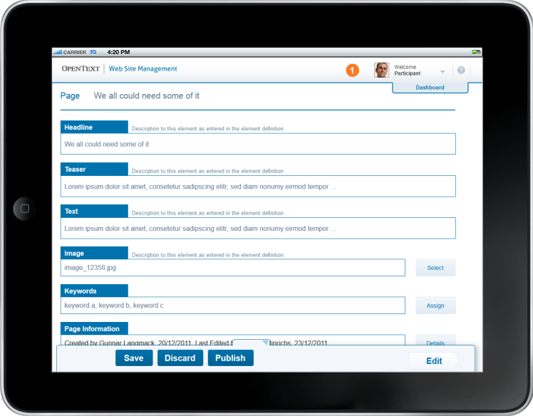
Figure #5: Form Mode
Tasks & Comments
Here we see the details of a page that has been sent into the workflow. Next to the options and information we’re used to such as the headline, buttons to release and publish the page there is a new comments area that allows better interaction with other colleagues who are involved in the workflow. But the more interesting thing is the button “Add Tab” at the top of the screen. Here you can create new lists of pages that all have the same characteristics (created by, created on, waiting for correction, etc.) and that really makes life easier. So if you plan to work on specific tasks (e.g.: checking all product pages that have been created by a specific co-worker)…no problem at all. Create an overview list and you’ll see the matching pages. And the best thing: If the list is finally empty, the work is done ;) !!!
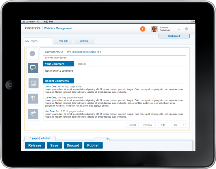
Figure #6:Tasks & Comments
Offline Capabilities
I know it’s hard to realize but there are times when we’re just offline ;) Either we’re on a plane or just in a tunnel when we travel by train…s*** happens… In order to make sure that the editorial work will not be disturbed by such tiny disadvantages the client doesn’t have to have a constant connection to the internet and therefore to the server. The system notices when there is a connection to the server automatically and transfers the work if possible. If it’s not possible, the work will be stored locally and transferred next time a connection to the server is available. (Of course there are understandable limitation: If someone creates a new content class on the server and there is no connection to the internet then it’s hard (not to say impossible ;-)) to use this content class. A really helpful functionality in regards to the offilne capabilities is displayed on the screenshot below: You can create new tabs that just display pages that are either stored on the local device or that are already on the server. And that makes the communication with co-workers much easier, because if a specific modification hasn’t yet been transferred to the server then its meaningless to try to talk about that modification with guys who sit in the office and are connected to the server.
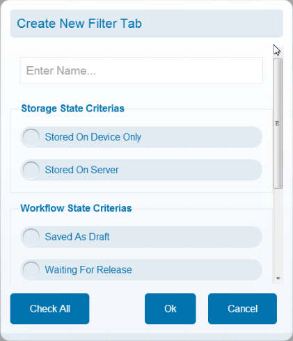
Figure #7: Custom Tab
So at the end I’d say that the tablet frontend of WSM is an important milestone in regards to web authoring. I guess editors and authors aren’t really more effective because of the features and functions of the the new mobile frontend but they’re more effective because they can work whenever they want and whereever they want. So from my point of view the flexibility in terms of locations makes the big difference.
As soon as the beta phase has started I’ll try to create a short video in order to give you a better impression of the look&feel.
As usual: If you have any questions, then just drop me a line or enter a comment!
Source: Sneak Preview “Mobile Frontend in WSM 11.2”
© copyright 2013 by Manuel Schnitger